
Share Market Toolbox
(public information)
|
|
Brainy's Share Market Toolbox (public information) |
 |
Weekly Share Market Analysis
|
|
| Price
charts
summarise the underlying opinions of the real market
participants. Every chart tells a story. You can watch out for the bears in the market by using Technical Analysis. Understand what is happening in our market each week, and learn about the secrets in the price charts. Take advantage of market movements as they happen - not way after. The price charts below explain
Robert's weekly analysis process. Most of these charts are reviewed and
updated weekly, |
| You are here: Share
Market Toolbox >
Share Market Analysis (overview)
> Weekly Market Analysis
Overview Related links: Weekly Analysis and Update email; Analysis overview (for members); Weekly Analysis (for members); Monthly Analysis (for members); |
|
|||||||
|
The charts below help to explain the concepts, and are updated from time to time. You don't need to understand everything about all the charts and details below. Just the first couple is a good start. The charts below are samples from the Weekly set of charts, and from the Monthly set of charts (for Toolbox Members). These charts and comments are purely observations of the market, based on one person's interpretation using technical analysis. They are of a general nature, and to assist with general education only. NOTE: Most of the charts shown on this page are NOT the latest information. The latest versions are reserved for the Toolbox Member subscribers. And there is no advice of any sort. It is recommended that you do NOT make any investment decisions based on the information shown here. These charts help to explain the concepts, and are updated from time to time. Click on any chart to see a larger view in a new window. The latest updated versions of these charts are readily available to Toolbox Members. |
Testimonials -
See
what people have to say about Robert's Weekly Market Analysis.
The charts below utilise some basic Technical
Analysis (charting) concepts and indicators.
The date of the chart is shown in the top right hand corner of the chart picture. The charts shown here are of the Australian All Ordinaries index (XAO) which is an aggregation of the "top" 500 companies in the Australian market. (What does "top" mean? Answer soon...)
|
||||||
|
On some occasions there might be something to comment about that is not covered in the other charts on these analysis pages. This might be a chart pattern (like the megaphone in early 2010), or a special indicator feature (like the Moving Average Golden Cross). Or it might be a comparison of the All Ordinaries (XAO) index to the Small Ordinaries (XSO) index. Or it could be the US Dow Jones Industrial Average index. If there are additional observations or comments to be made, then they will be shown here at right. And if the relevant comments are too extensive to be included on the chart itself, then they will be in the Special Comments section of the Weekly Share Market Update and Analysis email. If there is a chart at right, then Toolbox Members can see the latest comments in that chart. It is possible that a chart will be left here unchanged for a few weeks - so don't panic if it has an old date. |
The two charts
shown here are described in the
Weekly Market Analysis email. If there is a chart (or two) shown above, click on the chart(s) for a larger image in a new window. (Toolbox Members can access larger images) |
||||||
|
Perhaps the most important thing to look for firstly is the presence (or absence) of a price trend - and whether it is up or down. Also, to look for any possible support or resistance levels, and any possible chart patterns. It is useful to study two versions: a big-picture version that covers several years, and a shorter-term version. In Robert's weekly analysis, these two versions are available for Toolbox members - see the big-picture version updated monthly, and the short-term version updated weekly. The sample weekly chart at right shows a significant market low in March 2009, with a "Higher Trough" in July, and another "Trough" in November 2009. This was followed by the "Peak" in January 2010. Toolbox Members can see the latest versions of
these charts and comments in the Toolbox Members area -
big picture Monthly view and the shorter-term Weekly view. Over the same time period, the upward sloping green line is the trend line underlying the upward trend. An uptrend line sits under the price action and appears to act as support while the price moves down then bounces up off the line. Read more about trend-spotting. To best understand the bigger picture, a Weekly or even Monthly chart can be very useful, while the daily chart is very useful to understand what is currently happening. See the comments in the boxes on the chart for more details (click on the chart for a larger image in a new window). Latest versions - A tiny version of the latest "Big picture" and "shorter term" charts are shown at right, and Toolbox Members can click on these to see a larger version. Remember Brainy's 3Ways Rule (in 3Times). |
 The price chart shown here might be old; but Toolbox Members can see the latest weekly snap shot and comments in the Toolbox Members area. Not a Toolbox Member? - See the details here. The latest big-picture version and shorter-term charts are shown here:
|
||||||
|
The Coppock indicator on a monthly chart of the Australian All Ordinaries index (XAO) can be used to suggest possible turning points in the market. The upper half of this screen shot is a Monthly chart of the XAO. The chart is from 1987 to mid-2012. The lower half of the chart shows the Coppock indicator, oscillating above and below a central zero line. Both the upper and lower panes of this chart share the same time axis across the bottom. In early 2009, the Coppock turned up from a very low value (circled). This suggested that the market had bottomed (for the time being). In the years I have been watching this indicator, I have concluded that it might be useful for some longer-term traders and investors, but it is not useful for myself. So I have stopped updating the chart, and the Coppock charts in the Share Market Toolbox might now be a little old. |
 Not a Toolbox Member? - See the details here. |
||||||
 Stan
Weinstein published one really good text book in 1988 (Secrets for Profiting in Bull and Bear
Markets), and promoted a number of key
strategies and concepts, including the 30-week Moving Average on
Weekly charts, and the notion of Stage Analysis. Stan
Weinstein published one really good text book in 1988 (Secrets for Profiting in Bull and Bear
Markets), and promoted a number of key
strategies and concepts, including the 30-week Moving Average on
Weekly charts, and the notion of Stage Analysis.This chart shows that by January 2008 we should have been out of the market. And by April/May 2009 we could have been back into the market. And by May 2010 we should be out again! But how? 30-week Simple Moving Average (SMA)
on a Weekly price chart This is one of Weinstein's key principles. In the weekly chart of the XAO at right, the blue curve is this SMA. For as long as the price stays above the 30-week SMA, and the SMA line is heading upwards, Stan says the index (or stock) is rising. But if price crosses below the SMA and the SMA flattens and heads down, then there could be rough times ahead and it is time to sell. For example, in January 2008 and late April 2010. Stage Analysis
The coloured ribbon near the bottom of this chart is Weinstein's Stage Analysis ribbon. For more information on this see Brainy's eBook (PDF) Article ST-6410 (in the Members Area), entitled "Sample trading strategies - Weinstein", and you can refer to Weinstein's book, "Secrets for profiting in Bull and Bear Markets". |
 (this particular sample chart updated:- 9 May 2012) This chart is reviewed on a weekly basis along with updated comments and interpretations, and posted into the Toolbox Member area for Members. It is not the latest, but you can click on it for a larger version.
|
||||||
|
The Momentum indicator is a measure of how far the price has moved over a specific time period. It can be very useful on a monthly chart to indicate overall strength or weakness in the market. (On this chart we use a 28-period Momentum, and the same for Moving Average of Momentum. These are not the normal default values in most charting software tools). The upper portion of this screen shot is a Monthly chart of the XAO (All Ordinaries index) from 2003 to mid-2012. The lower portion shows the Momentum indicator (the squiggly red line), and a Moving Average (MA) of Momentum (the smoother blue line). Toolbox Members can see the latest chart and
comments in the Toolbox Members area.
The MA of Momentum turned down sharply and crossed below the Momentum line in late 2007. This suggested weakness in the market. It was time to be out. The strong rise in the red MOM in 2010-2011 suggested strength in the market; but perhaps way over-done. Falling Momentum suggests weakening prices. Momentum bottomed in early 2009 and rose. This looks positive; but the MA of Momentum was still falling. Click on the chart to see a larger image in a new window. |
 This particular chart is reviewed on a monthly basis along with updated comments and interpretations, and posted into the Toolbox Member area for Members. A shorter term version is discussed in the next item below.
Not a Toolbox Member? - See the details here. |
||||||
|
For a big-picture perspective, the Momentum (MOM) indicator is shown above on a Monthly chart. At right it is shown on a Weekly chart of the XAO (All Ords index) - the squiggly red line in the lower half of the screen shot. (The smoother blue line is a Moving Average of the Momentum, and in BullCharts is called a Smoothed Momentum indicator). Observe the little peaks every few months on the Momentum line (the red squiggly line), and compare them with the corresponding peaks in the price curve directly above it. Notice if successive Momentum peaks are higher and higher, or lower and lower. There are some instances on this chart where successive peaks in Momentum are lower than the previous peak; but the corresponding peaks in price are higher (marked with A and B). This is known as bearish divergence, and suggests a possible pending down turn in price. See more about divergence. Similarly, when the Momentum troughs are rising and the price (or index) troughs are falling (indicated with C), there is bullish divergence - suggesting a possible turn up in prices. See more about divergence. The lower highs in Momentum by December 2007 (area A) were a definite sign of weakness in the market, and a warning that we should have been out of the market. Nobody can say there is no warning of a market fall pending. Click on the chart to see a larger image in a new window. |
Momentum
indicator (big picture) (chart updated:- 9 May 2012) This particular chart is reviewed on a weekly basis along with updated comments and interpretations, and posted into the Toolbox Member area for Members. It is not the latest, but you can click on it for a larger version. Question: - A 28-period Momentum is above here. Why? See the Toolbox Members area.
|
||||||
|
The family of money flow indicators are actually an oscillator type of indicator as they oscillate above and below a zero line. They give an idea of whether the net flow of money is into the stock (or index), or out of the stock. Falling peaks in money flow with rises in the price (eg. at A in the chart at right) suggest net money flow out, and a possible pending fall in the price. Money Flow indicators can also give confirmation of trendline breakouts and support / resistance breakouts. The chart at right comprises a simple, regular Weekly Line chart of the XAO index in the upper half, and the Twiggs Money Flow (TMF) indicator in the lower half. A TMF value above zero suggests accumulation (bullish), and below zero suggests distribution (bearish). Downtrending TMF suggests weakening, and uptrending suggests strengthening. Bullish Divergence and Bearish Divergence As with the Momentum indicator above, we can look for divergence between TMF and the index (either bullish divergence, or bearish divergence). That is, higher peaks on the index accompanied by lower peaks on the TMF, or lower troughs on the index with higher troughs on TMF. Note the areas marked "A" on the chart, and on the TMF directly below it. The index made a higher high in October 2007, while TMF did not make a higher high. This is bearish divergence. This divergence was apparent on the chart by November 2007. By January 2008, the TMF indicator was decidedly lower, and confirming that we should have been out of the market. In the area "B" in late 2008 and early 2009, the chart is showing the index making Lower Lows, while the TMF indicator is NOT making Lower Lows - the lows are all about the same. This is a minor form of Bullish Divergence, and forewarns of a possible turn-up in the market. Notice the bearish divergence at "C" on the chart as at late December 2009! TMF was falling decidedly while the index tracked sideways!! Is TMF simply moving back towards a neutral zero level before another leg up in the market? or is it warning of a pending fall in the market? Click on the chart to see a larger image in a new window. |
This particular chart is reviewed on a weekly basis along with
updated comments and interpretations, Which period to use? - Colin Twiggs
advises: "I use 13-week for the long (primary) time frame
Not a Toolbox Member? - See the details here . * - Ack: Colin Twiggs www.incrediblecharts.com/indicators/twiggs_money_flow.php |
||||||
|
The Guppy Multiple Moving Average indicator (GMMA) is one of a family of Multiple Moving Average indicators which can be used to determine the mood, sentiment and direction of the market. The GMMA is comprised of two sets of six Exponential Moving Averages (EMA). The blue group of six represent the shorter-term investors (actually the traders), while the red group of six represent the longer-term investors. Once trained in how to interpret this indicator, it is possible to interpret a lot about the character and nature of any trend - either an uptrend, or downtrend. (See more information about the GMMA indicator and this chart in the Member Area here). The start of the weekly XAO chart at right (late 2006 and into 2007) shows a nice set of blue and red EMA lines indicating a healthy uptrend. The red ones are rising nicely and evenly spaced and roughly parallel, while the blue ones are a nice distance from the red ones, and they are gently waving up and down with the trend. But in July 2007 there was a severe dip of the blue lines into the red ones, and the red ones leveled out before uptrending again. This pattern was repeated in December 2007 and continued looking worse. This was a definite sign to be out of the market. Click on the chart to see a larger image in a new window. The sample chart here is a candlestick chart so that we can see the range in price in each week. Each candle summarises the price action for a week - hence the chart is a weekly chart. I now analyse and comment on, and share two versions of the GMMA chart as follows:
See more information:
|
 (chart updated:- 9 May 2012) This particular chart is reviewed on a weekly basis along with updated comments and interpretations, and posted into the Toolbox Member area for Members. Toolbox Members can see the latest version and comments here. The latest big-picture and shorter-term charts are shown here:
Not a Toolbox Member? - See the details here . |
||||||
|
Individual candlesticks have characteristics - long or short body (or no body), absence or presence of upper and/or lower shadows (aka tails), and the length of shadows if present. And two or more consecutive candlesticks together can present as a known pattern. In the Weekly Market Analysis we take a look at the last few weekly candles, and draw conclusions about market sentiment based on the size of candle bodies and the presence or absence of candle shadows. 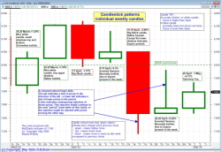 This is a tiny version of the latest chart that is available for Toolbox Members. Toolbox Members can see the latest version and comments in the Toolbox Members area. |
 It is useful to look at a candle chart, and look out for various features of single candles, and of candle patterns - two or more adjacent candles. See more about candles and patterns here. Robert's weekly study includes this, to produce the chart shown at left which includes updated comments and interpretations, and is posted into the Toolbox Member area for Members. Toolbox Members can see the latest version and more comments here. Not a Toolbox Member? - See the details here. |
||||||
|
The OBV indicator compares volume to price in an attempt to measure the amount of accumulation or distribution. It works on the premise that larger investors / traders accumulate and distribute stock in higher volumes prior to a corresponding move in share prices. For a positive and bullish sentiment we want to see the OBV trending higher whilst the market trends higher. Experience has shown that it can be useful to view both a daily version of this chart, and a weekly. Toolbox Members can see more information, and the latest weekly snap shot and weekly comments in the Toolbox Members area. |
 This particular chart is reviewed on a weekly basis along with updated comments and interpretations, and posted into the Toolbox Member area for Members. Toolbox Members can see the latest version and comments here.
Not a Toolbox Member? - See the details here. |
||||||
|
Observing volume, and how it is performing in comparison to price, is very useful. It is useful to observe whether:
(ie. trends are confirmed in volume". This applies to viewing a weekly chart to help understand the big-picture moves over a long period in time, as well as a daily chart to understand the moves from day to day. So we look at two variations:
|
 A version of this chart is reviewed both on a weekly basis and monthly, along with updated comments and interpretations, and they posted into the Toolbox Member area for Members. The Big picture version is weekly chart while the short-term chart is a daily chart. Tiny versions of the latest charts are shown below.
Not a Toolbox Member? - See the details here. |
||||||
|
Sometimes the intraday view can be useful. Most investors don't get to see the intraday view very often; but traders with intraday access and charts can see it when they want. Sometimes this chart shows the sharp sell-off, or sharp rise, that sometimes takes place at the market open, within the first 10 minutes of trade. And sometimes this chart shows a steady rising (or falling) trend that can persist for a couple of days. Click on the chart for a larger image (not the latest). Toolbox Members can always see the latest charts in the Toolbox Members area. Toolbox Members can see the latest weekly snap shot and comments in the Toolbox Members area. 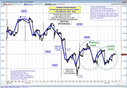 This is a tiny version of the latest chart that is available for Toolbox Members. Toolbox Members can see the latest version and comments in the Toolbox Members area. |
 This particular chart is reviewed on a weekly basis along with updated comments and interpretations, and posted into the Toolbox Member area for Members. Toolbox Members can see the latest version and comments here. Not a Toolbox Member? - See the details here. |
||||||
| Conclusion? Price charts summarise the underlying opinions and emotions of the market participants (this is Technical Analysis). The charts and technical indicators above did give clear warning signs by January 2008 (and again by May 2010) that the market could have turned down in the very near future. By using charts and indicators like these, it is possible to be forewarned of possible market falls. You can take action to protect your hard-earned capital! Don't let it dwindle away. Robert's Weekly Market Analysis uses the same charts and indicators. You can see the details every week! Go to the secure OnLine Shop and sign up now. Not ready to commit?... You can receive the same Weekly Analysis email once each month by registering your interest... See the big blue button above.
|
|||||||
|
Not convinced of the benefits of Toolbox Membership? The chart at right is a fairly recent sample of the detailed close-up charts from the Members Area of the Toolbox, with more recent (weekly) comments. Click on the chart for a larger image, and judge the value for yourself. More information about candlesticks. Or click here for more information about the
TOOLBOX MEMBERS AREA. OR Go to the MEMBERS-Only Weekly Market Update page The system will prompt for your Members Username and Password. |
 The price chart shown here might be old; but Toolbox Members can see the latest weekly snap shot and comments in the Toolbox Members area. Not a Toolbox Member? - See the details here. |
||||||
Toolbox Members area? More information about the TOOLBOX MEMBERS AREA. |
|||||||
The information presented herein represents
the opinions of the web page content owner, and
are not recommendations or endorsements of any product, method, strategy,
etc.
For financial advice, a professional and licensed financial advisor should
be engaged.

. Click on the chart for a larger image.")
. Click on the chart for a larger image.")


