Why is the notion of a trend important?
One of the key tenets of Dow
Theory basically says:
Once a trend is in place, then it is likely to
remain in place; and
the trend continues to exist until it is confirmed to have
ended.
This is very important, and it is a fundamental principle that
underlines a lot of the success in the market.
Why is it so important or useful? Because if we can identify a
share price rising trend for a stock, and buy some, we can ride
the trend.
It applies to the uptrends, which the average investor /
trader might ride, as well as to the downtrends which
many investors and traders hope to avoid. See more details about
this in the material below.
For more information about Dow Theory, see the More
Information list at right, and also see
more information here about Dow Theory.
Brainy's "3Ways Rule (in 3 Times)"
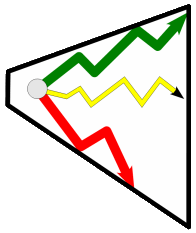 Any stock or index will
always be trading Any stock or index will
always be trading
in one of 3 "ways":
- in an uptrend, or
- in a downtrend, or
- there will be no trend.
This is a simple re-statement of one tenet of Dow Theory; but it is
a useful way to remember a simple fact about the price chart. That
the chart will show an uptrend,
or a downtrend,
or no trend.
See more information about the 3Ways Rule.
Why avoid a downtrend?
It is important to avoid the downtrends, because they
are likely to continue. When a share price is falling, many people
are tempted to purchase it because it seems to be cheap. And many
commentators and brokers might recommend to buy it because the
share price offers great value. But how do we define great
value? Well, this is very subjective (read more about this topic here).
Because a downtrend is likely to continue, many investors /
traders will not buy the stock until the downtrend is confirmed to
have ended, and a new uptrend has started. Exactly how to do this
depends on a few things, including the time period of the charts
that you study (ie. weekly, daily, hourly, etc.).
How to spot a trend
There are a number of ways to spot an up-trend:
- The simplest eye-ball call
On a price chart, if the price starts in the bottom left
corner and finishes in the top right corner, it must be
trending up (as in the sample at right - click on the image
for a larger version).
.") Higher Peaks and Higher Troughs Higher Peaks and Higher Troughs
A rising trend is described in classical Dow Theory as a series of Higher Peaks
and Higher Troughs, or as Higher Highs and Higher Lows. This
is demonstrated in the sample chart at right, where each
Higher High is denoted with "HH" and each Higher Low with
"HL". The terms "higher peak" and "higher trough" are also in
common use in reference to a rising trend. However, in the
strict use of the terminology, there is a different between
the "highs and lows" and the "peaks and troughs".
- Trend Line
As a price moves higher, it may be possible to place a rising
straight line under the share price (as in the chart image
above). This line appears to act as a "floor" to support
rising prices. As long as the price stays above the trend
line, then the up-trend is said to be in place. Once the price
breaks below the trend line, then the trend is said to have
failed.
.") Moving Average Moving Average
We can use a Moving Average chart indicator on the price chart
to indicate whether a price is "trending" up or down (or not
at all). In the sample Monthly price chart at right (click on
the image for a larger version), a Moving Average (MA) is
shown as a blue line. It can be inferred that where the MA is
rising, the stock is also tending to rise (ie. uptrending).
Conversely, a falling MA suggests the stock is trending down.
Of course, the picture might be different on a weekly or daily
chart, and the number of periods we use in the MA indicator
can also make a difference. For a realistic example of using
this idea to spot rising trends, see Brainy's Weekly Watch List strategy.
The health and strength of a trend - MMA
The health and strength of a trend can be quickly
determined using a number of different technical analysis chart
tools, including the Multiple Moving Average (MMA)
indicator on the price chart. There are more than a couple of
these in existence in good charting software packages including
the Guppy MMA (or GMMA for short) and the Hull MMA.
.") The
sample chart at right is the same chart as shown in the MA example
above, except that this time a Guppy MMA indicator is included. At
first glance, this indicator looks complex; but it is not. It is
comprised of 12 MA lines - a group of 6 blue ones, and a group of
6 red ones. For the trained analyst, this is very helpful in
telling us about the health and nature of a trend (the mood and
sentiment). The
sample chart at right is the same chart as shown in the MA example
above, except that this time a Guppy MMA indicator is included. At
first glance, this indicator looks complex; but it is not. It is
comprised of 12 MA lines - a group of 6 blue ones, and a group of
6 red ones. For the trained analyst, this is very helpful in
telling us about the health and nature of a trend (the mood and
sentiment).
See a sample use of the GMMA in Robert's
Weekly
Market Analysis.
Other tools for determining trend strength include: the simple
trend line, a simple linear regression line, Alan Hull's ROAR
indicator and the ADX indicator.
For more information, see the eBook Articles listed above right.
How to quickly find a trend with little effort
If you are using good charting software, with a good
scan tool, then it is not hard to quickly scan through a long list
of stocks and display a short list of the stocks that currently
exhibit the characteristics of a trend.
One good software tool is BullCharts,
where it is possible to easily create a scan to search for
trending stocks. Brainy's eBook (PDF) Article BC-10-400, "Scans - Match (not) all criteria"
(page 2), discusses this.
And a down-trend...
It is not only up-trends in which we are interested; but
also down-trends. If we feel that a stock in a down-trend is
over-sold and potentially a great bargain, we can monitor the
price chart for a confirmed break of the down-trend. And those
people who are happy to short-sell a stock, can look for confirmed
down trends, and sell into the down-trend.
To visually spot a down-trend on a price chart, we look for the
opposite of the signs of an uptrend - a series of Lower Highs and
Lower Lows (or Lower Peaks and Lower Troughs).
Case Study - NAB
.") A down
trend is demonstrated in the weekly price chart of National
Australia Bank (NAB) at right from late 2007 until mid-2009 (click
on the chart for a larger image). NAB fell 61% from $43 to $16
over a 16 month period during the so-called infamous GFC (btw -
imagine a blue chip stock falling 61%!). The comments on the chart
at right explain the red down-trend line, and the observed
break-out in March 2009. A down
trend is demonstrated in the weekly price chart of National
Australia Bank (NAB) at right from late 2007 until mid-2009 (click
on the chart for a larger image). NAB fell 61% from $43 to $16
over a 16 month period during the so-called infamous GFC (btw -
imagine a blue chip stock falling 61%!). The comments on the chart
at right explain the red down-trend line, and the observed
break-out in March 2009.
In this chart of NAB we have placed a downward straight line above
the price action, and it appears to act as a ceiling to prevent
prices from rising. Once the price does break above the down-trend
line, it can be said that the trend is over (as indicated toward
the end of this sample chart).
Case Study - MYR
 In
the next chart at right, we can see two periods of uptrends
(indicated with the green arrows) over the 8 years or so since the
Myer IPO in 2009. But for the rest of the time, the share price
was in a downtrend. We can easily see a sequence of Lower Peaks
and Lower Troughs across most of this chart. In
the next chart at right, we can see two periods of uptrends
(indicated with the green arrows) over the 8 years or so since the
Myer IPO in 2009. But for the rest of the time, the share price
was in a downtrend. We can easily see a sequence of Lower Peaks
and Lower Troughs across most of this chart.
Trends in multiple time frames
The discussion above is kept simplistic for introductory purposes.
However, it is important to continue the study of trends in
order to consider price trends in multiple time frames. This
differentiates from trends in the short term, from a very likely
different trend in the medium term, and from the longer term.
This next level of study involves the consideration of the highs and
lows on the candlesticks or bars, as well as the existance of peaks
and troughs on different period charts, such as the daily versus
weekly versus monthly charts.
For more information on this, see Trends in multiple time frames (restricted
access to Toolbox Members only).
More information?
For more details about Trends, how to spot them,
and how to use them, see the Share Market Toolbox links at the top
of the column at right.
|
More Information
Case studies - in numerous articles published by The Age
(Fairfax press), and the ASX.
eBook Articles - Share Market Toolbox Members can see
more details in the following eBook Articles:
(Toolbox non-Members can see the "Page 1" of these Articles from the
Master
List page.)
Robert writes information from time to time about the
market and investing. If you are not a Toolbox Member,
you can register to receive useful free information as it is
published.
Privacy ensured,
unsubscribe anytime.
See the
Testimonials - the things that people say about the
Toolbox and more.
|
Terminology
Any special terms that might be used in the text at left, can
probably be found discussed in the Toolbox somewhere. Perhaps
in Brainy's eBook Articles - see the Master Index list for details. Or, search the eBook
Articles.
The
Share
Market - more information about the market and investing and
trading.

The toolbox is an arsenal of weapons to help you tackle the share
market.
See a list of contents on
the Toolbox
Gateway page.
Robert Brain provides various
support to both new and experienced traders and investors.
Who is Robert Brain?

And whatever you do,
beware of the sharks in the ocean!
|


.")
.")
.")
.")
