|
Brainy's
Share Market Toolbox |
 |
ASX Investor Update
|
 |
Consumer staples stocks - Should food stocks be a portfolio staple?The
September 2016 edition of the ASX Investor
Update
newsletter features an article Every chart tells a story - it pays to understand the stories in the price charts!Included
below is more information, and larger versions of the
charts |
| You
are here: Share Market
Toolbox
> ASX Investor Update
> ASX
Investor Update September 2016 - more information Related links: Summary list of other ASX articles; About the Share Market; Robert's Philosophy; Share Market GEMs; Share-Market-Ready; Funda-Technical Analysis; Sensible Investing; Contrarian Investing Redefined; |
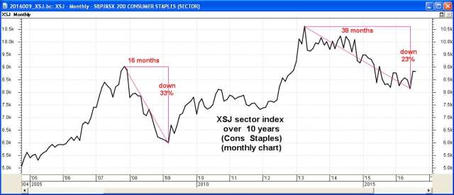
The September 2016 ASX Investor Update newsletterWhen Robert prepared the material for the September 2016 edition of the ASX Investor Update newsletter, he grabbed four good charts (shown below) and wrapped some good commentary around them. But the article ran out to more than 1700 words (more than the publishing word count limit for the newsletters). So we reduced the submitted material down to the limit by chopping out some useful informational detail.However, the material below is the original article in full, and including larger versions of the price charts (click on the images for a larger version). For the published text of the September 2016 article that Robert authored, and the published price charts, see the ASX article - "Should food stocks be a prtfolio staple?" and the full edition of the September 2016 newsletter. Consumer staple stocksConsumer staple products are those essential items which consumers are unable or unwilling to reduce from their weekly spend. And so it follows that consumer staples stocks are often talked about as an essential ingredient in the portfolios of retail investors. This might be true, but does it translate into stocks that are winners for retail investors? Or is there too much risk of loss of capital? In this article we look at the consumer staples sector, and three key consumer staple stocks Woolworths, Wesfarmers and Metcash. The consumer staples sector index (XSJ)First of all, lets look at the price performance of the consumer staples sector of the Australian share market the Consumer Staples sector index (ASX code: XSJ). Dont forget that the sector indexes only comprise stocks from the so-called top 200 stocks. That is, from the S&P/ASX 200 (XJO) index. Currently, the XSJ sector comprises only 15 stocks with Wesfarmers being the largest by market cap with a value of $45 billion and comprising 45 percent of the sector index. Woolworths is the second largest ($30 billion and 28 percent), and Metcash is seventh (only $1.8 billion and less than 2 percent of the index). The first price chart below is a monthly chart showing the XSJ sector index over 10 years. Dont forget, the monthly line chart only shows the last price in each calendar month (or the last calcuated value for an index), and indicates nothing about price movement during the month.
Is the consumer staples sector a safe haven in tough times? Well, it fell 33 percent over 16 months during the GFC in 2008, and it was down 23 percent over 3 years from a peak in early 2013. With Wesfarmers comprising 45 percent of the sector index, we might expect this index chart to look something like the chart of Wesfarmers. So, the first lesson here is that it might be a waste of time focusing on sector performance (because some stocks can be over-weight in the sector). So how have other stocks in the sector performed? And what about other consumer staple stocks that are not in the top 200 and therefore not in this sector index? There are currently 56 of them. Percentage performance comparisonThe
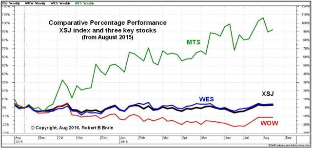
next chart is a
comparison showing the percentage performance of our three
stocks and
the sector. Note the vertical axis is percentage performance,
and set
to be zero at a date in August one year ago. We can see that
Metcash
is up about 90 to 100 percent over the year. Dont you wish you
could have been invested in that one? (A trend following
investor
could have been.)
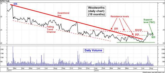
We also notice in this chart that Wesfarmers and the sector index track each other very closely and we know why (explained above). They have been flat for the last 12 months. Any money invested there would have been a lost opportunity. We can also see that Woolworths has underperformed the other two stocks and the sector index. The second key lesson here is to watch the price trend. One of the six key tenets of Dow Theory basically says that a trend is a trend is a trend, until it is no longer a trend. An extension of this is the technical analysis principle that a confirmed uptrend (or downtrend) is likely to continue. [This is basically because of investor sentiment, and opinion about share prices, and their trading and investing behaviour in the market. Their market participation leaves stories in the price charts.] Looking back to the last chart, and the performance of Metcash, the line on this chart looks exactly like the real price chart, and the real price ranged from a low of about $1 in August 2015, up to more than $2 a year later. Study this chart. Notice that almost every time the price of Metcash dipped and formed a new trough on the chart, the trough was higher than the one before. And except for the middle of the chart we can see successively higher and higher peaks (an uptrend). The pause in the uptrend from January to April 2016 simply shows that the majority of buyers were not convinced that higher share prices were justified at that point in time. The price had run too far ahead of itself, and was simply biding time waiting for the price to catch up. So, what about that stock that the experts say needs to be in everyones portfolio? They say that the consumer staple stocks are stable through good times and bad. Except not Woolworths over this period in time. WoolworthsThe next chart is a daily price chart of Woolworths over 18 months from a peak in February 2015. It clearly shows a downtrend. As the price cycled up and down, it made successively lower troughs and lower peaks. The downtrend line sits on top of the price action and appears to act like a ceiling above the share price. The red dotted line under the falling price action is not quite parallel to the downtrend line, but forms the other boundary of the Falling Trend Channel (this is a useful tool to help us analyse and understand price movements).
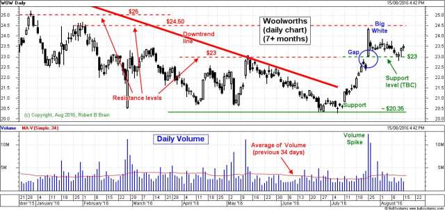
Note the following observations of this price chart. The price trough in July 2016 is about the same level as on two previous occasions (April and May). This tells us that the majority of investors believed that the shares were worth more than about $20 (actually $20.35 see the next chart). This floor under the price is a support level. It is unlikely that the price will fall below here (it is possible but unlikely). Since the July trough, the price has rallied to about $24 and fallen away. We are not surprised by this, as it is roughly the same level as a peak several months ago. We call this overhead resistance. The likely explanation is that investors who bought at this level back in May have been disappointed with the falling share price, and simply want to recover their funds by selling when the price gets back to this level (thats behavioural finance). So, we might ask ourselves if the share price is likely to resume the recent uptrend. Here are the technical analysis chart observations. In mid-August 2016 the price dipped to about $23 the same level as resistance back in May but the old resistance level might now be a support level (we call this a change in polarity). On the chart this is marked as Support level (TBC). Candles and volumeBut for more clues we know that we should also look at the daily volumes. The next chart shows this as well as the daily candlesticks instead of a simple line. On a daily candle chart, each candle summarises the range in price each day, and shows us the open price and close price, as well as the high and low for the day. It tells us more about the stories behind the scenes. This chart is zoomed in to show only the last 7 months. See more information about candles.
Note a few observations from this chart as follows. Some of the previous peaks are marked as resistance levels. They were resistance in the past and they might form resistance levels again, as the share price rises in the weeks and months ahead. The downtrend line sits on top of the falling share price; but in July 2016 the price pushed above the downtrend line to indicate a weakening of the downtrend. Then the price rallied strongly and in late July (Monday 25th) gapped up above the $23 resistance level. This tall white candle is known as a Big White candle it has no lower tail and a very short upper tail and is considered bullish. Note the daily volume on the same day a Volume Spike which is about four times the daily average of volume (the red line across the volume pane is the average of the previous 34 days a 34 day Moving Average). The high volume continued into the second day; but with a much shorter candle. Until the end of this price chart (15 August) the share price traded within the range of that Big White candle. This indicates that some market participants were keen to sell because they believed the price was too high, while others were keen to buy because they believed the price was good value. This is the typical tug-of-war between buyers and sellers that takes place every day in the markets. Will the Woolworths share price continue the uptrend from the low of $20.30 in early July? We cant tell from this chart. Since the Big White candle, the daily trading has been mostly within the range of the lower half of the Big White. If the shares can trade higher than the middle of this candle, it will be bullish. If the share price can continue to form higher peaks and higher troughs, it will confirm an uptrend is in place. If it moves higher than the top of the Big White and stays there, that will be confirming the uptrend further, and very bullish. However, if the price falls below the $23 support level, it will be warning of further possible downside. Technical analysis considers the probability of future outcomes, and does not attempt to predict the future.
More Information?Do refer to the online article at ASX.com.au for the published version of this article. Want to understand more about how to interpret the price charts? See the details in the right-hand column above... |
To
print this web page - in your browser select the printing
option "Shrink to fit". View larger versions of the charts below by clicking on the chart. More informationTo understand more about how to interpret the underlying mood and sentiment using the price charts:
Share
Market Terminology
See Brainy's eBook Articles, and the Master Index list for details. Or, search the eBook Articles. Robert Brain provides support to both new and experienced traders and investors. Who
is Robert Brain? 
The toolbox is an arsenal of weapons to help you tackle the share market. See a list of contents on the Toolbox Gateway page. The Share Market - more information about the market and investing and trading.  And whatever you do,
beware of the sharks in the ocean! |


 Also
note one key
aspect of the above discussion. We started by looking at the big
picture a longer time period on a monthly chart (because