Price action context a definition:
The study of share market price action in conjunction with other
relevant information such as:
- the price action in previous days or weeks (or months or
more), and
- technical analysis chart features (eg. patterns, support,
resistance, etc.); and
- looking at other time periods, and
- looking at relevant news and announcements.
|
How to learn more
about technical analysis?
Technical
Analysis - Getting Started - Robert's suggested
steps on how to make progress with learning about
Technical Analysis.
More information
 Funda-Technical
Analysis - An investment and trading approach
utilising a sensible balance of both Technical Analysis
and Fundamental
Analysis. Funda-Technical
Analysis - An investment and trading approach
utilising a sensible balance of both Technical Analysis
and Fundamental
Analysis.
 Brainy's
3Ways Rule - a smart way to understand
trends, and the importance of spotting trends. Brainy's
3Ways Rule - a smart way to understand
trends, and the importance of spotting trends.
Brainy's extensive list of eBook (PDF) Articles
on Technical Analysis and other topics.
Brainy's seminars on Technical Analysis and
other topics - click here for details...
A variety of publications on Technical Analysis and
related topics - click
here for details...
ATAA
Australian Technical Analysts Association
 The ATAA is
Australia's pre-eminent not-for-profit organisation
regarding technical analysis. The ATAA is
Australia's pre-eminent not-for-profit organisation
regarding technical analysis.
Some of the experienced ATAA members have contributed to
regular articles in The
Age and Sydney
Morning Herald newspapers. Scanned copies of these articles are
available for perusal.
Robert is a member of the Australian Technical Analysts
Association (ATAA). He is (since 2009) also the
Melbourne Chapter Vice-President, and a director on the
national board. Robert endorses the ATAA as a worthy
not-for-profit association for people looking for
education, help and networking.
See more
information about the ATAA.

And whatever you do,
beware of the sharks in the ocean!
|
Exactly what is "price action context"?
It is not widely discussed, but this term actually means different
things to different people. Some brokers refer to it to help guide
the thinking of their clients and to encourage particular
strategies, especially for use with intraday trading, and also with
forex trading.
My own preferred definition here is of more use to the average
retail investor or trader in the share market, and considers several
aspects which can be described as follows, particularly for the
benefit of share traders who are short to medium term (ie. from a
few days to many weeks or a few months) and who utilise technical
analysis.
The observation of an odd
or unexpected
share price movement
which can actually be explained by
a company announcement or other news or
even the simple price chart.
Further to this:
- By all means look at a share price movement in the last day or
so, but also look at several recent days, and even weeks.
- If viewing a price chart, then make sure to look at another
time period as well. That is, if viewing a daily chart, then
also look at the weekly.
- It can be useful to look at recent news for the stock, as this
might explain the price behaviour.
- If looking at the price performance over a particular time
period, then also consider looking over a different time period.
Why is all this important?
Especially for the average retail investor and trader, this can be
very useful so as to avoid some of the possible pitfalls that await
the inexperienced (and the experienced), but more so so that you can
better understand the "bigger picture" (remember that the market is like an elephant). Things like the
actual share price trend which might not be apparent from the price
chart you are looking at. Or change you view about whether the
latest large volatile move was random, or could have been
anticipated.
When a technical analyst studies the price charts in order to make a
judgement call about the likelihood of future price behaviour, we
need to remember that the price action can be influenced by new
news, or a company announcement. Once this new news becomes known,
then other investors in the stock will adjust their opinion about
fair value, and in turn this might result in additional buying or
selling of the security.
So when we study the price action, and try to understand why the
price did not behave as we thought it would, it can be very useful
to look at the context within which the share price is responding.
Problem #1 - The news media numbers
The first problem to be aware of here is that the news media are
very good at reporting today's share price movements, either of a
particular stock, or several stocks, or an index. In Australia, our
major TV stations do this routinely every day, and radio stations do
likewise.
The worst example of this is on Monday morning when the radio
announcers declare something like "...the Dow Jones
fell 700 points over night...". The first issue
here is that the Dow Jones index is based on stocks listed on the
New York Stock Exchange (NYSE) which trades until 4pm on Fridays.
And this coincides with 6am Melb/Sydney time Saturday (or 7am or
8am, depending on whether daylight savings is in place for either
the USA or Australia). So, when the Dow Jones reportedly fell 700
points, it was actually 2 days prior! The second problem here is
that it is much more useful to report such market moves in
percentage terms, and not in "points". If 700 points equates to just
1 per cent, then this is a quite acceptable amount. However, if it
is actually 5 per cent, say, then this is more significant.
Problem #2 - The news media headlines
Take a look at this typical example of sensationalising the numbers.
On 12 June 2020, one well respected newspaper and website reported
the following headline:
"ASX down 2.5pc for the week; $90b wiped in two day
sell-off". (See the online article here).
Wiping off $90 billion in a 2-day sell-off sounds somewhat alarmist
doesn't it? But this tiny amount is insignificant in many ways. This
is explained with the following examples and commentary.
Additional thoughts
- The daily or weekly traded volumes can also be very telling,
as per Dow Theory.
- If you are studying a price chart and cannot work out why a
share price has moved the way it has, take a look at the news
because very often the news will help to explain it.
|
Case study example #1 - Coronavirus bear market of 2020
|
Markets down heavily with little warning
In February 2020 with little warning, many share markets
collapsed. In Australia, the All Ordinaries index (XAO) fell
37 percent over just 4 weeks. In this situation it was
fairly easy to understand the reasons why - provided we were
aware of the unfolding coronavirus situation. |

|
Case study example #2 - XAO index in June 2020
The following considers one specific example of the All
Ordinaries (XAO) index in June 2020. (Click on the price
charts for a larger version.)
|
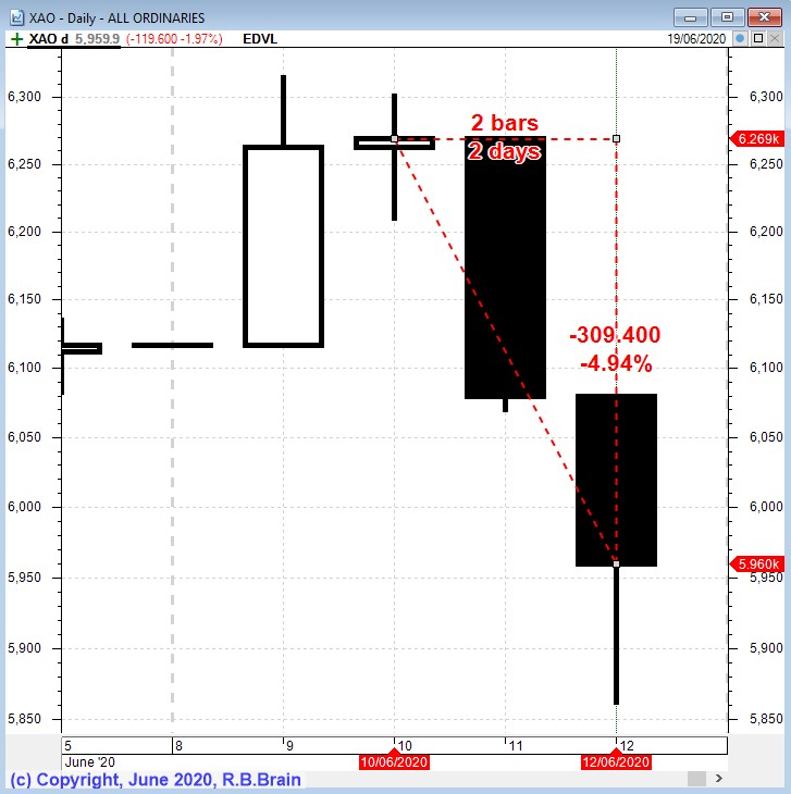
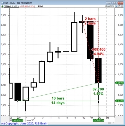
Down heavily in just 2 days
In the daily candlestick price chart at right, the All
Ordinaries index (XAO) fell heavily in just 2 days to be
down 4.9 per cent. It actually fell on the following day as
well to take it down even further.
The news media made sensational headlines and announced the
huge dollar value that this fall represents. What they
didn't say is what is explained in the next block below. |

|
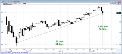
Index finishes up in 2 weeks
Instead of looking at just the last 2 days of price action
(above), we could step back a little and look at the last 2
weeks of price action as shown in the price chart at right.
Notice in this chart that the fall of 4.9 per cent is still
indicated on the chart, but when we zoom out on the chart we
can see that it is actually 1.5 per cent higher than several
days earlier, on Friday 29th May.
So, when we take the latest price action in the context of
the last 2 weeks, we can see it's not such a big deal. If
the index doesn't fall any further, then so what about the
latest fall? Could you call the new headline
over-sensationalising?
|
|
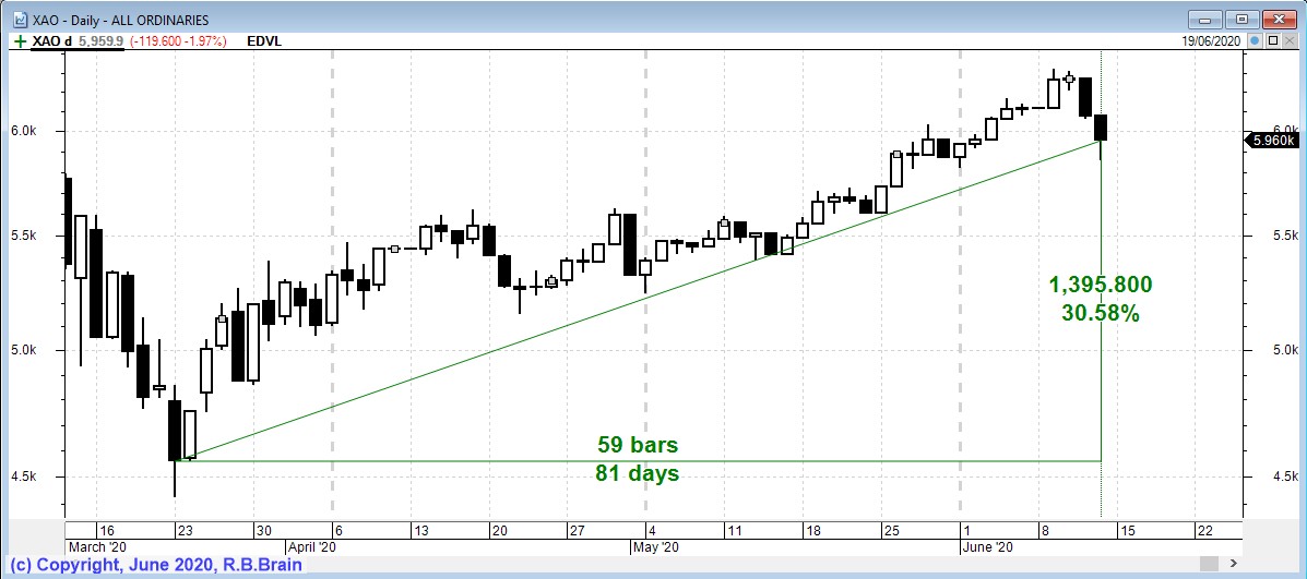
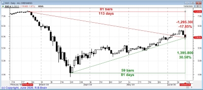
Index is actually up 30 percent!
Now zoom out the chart even further so that we can see at
least 12 weeks of price action, as shown in the price chart
at right.
Note the nice uptrend since the lows of 23rd March, and that
the index is actually up 30 per cent from those lows over a
period of 12 weeks. So it is very important to consider the
context within which the price action is taking place.
|
|
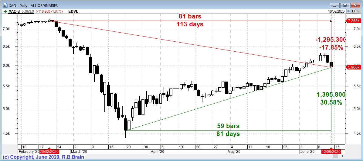
Index is still down 17 percent!
The next chart at right shows the same index but zoomed out
even further so as to see the all-time market highs of late
February 2020 before the global coronavirus pandemic caused
widespread shudders around the world, and impacted heavily
on economies and financial markets all around the world.
The reality as of 12 June 2020 was that the index might have
been up 30 percent from the March lows, but it was still
down 17 percent from the highs of February.
So we can see that looking at the bigger picture and being
cognisant of the recent price action is very valuable to
help keep everything in perspective. We call that price
action context.
A good argument could be made for paying more attention to
the business and finance news items, and even to browse the
market announcements that companies make to the stock
exchange. There could be a lot of useful explanation hidden
within those news items.
|
|
Case study example #3 - Superannuation performance for
FY20
The following considers the possible performance of a
"typical" superannuation fund for the financial year
2019-2020.
(Click on the price charts for a larger version.)
|
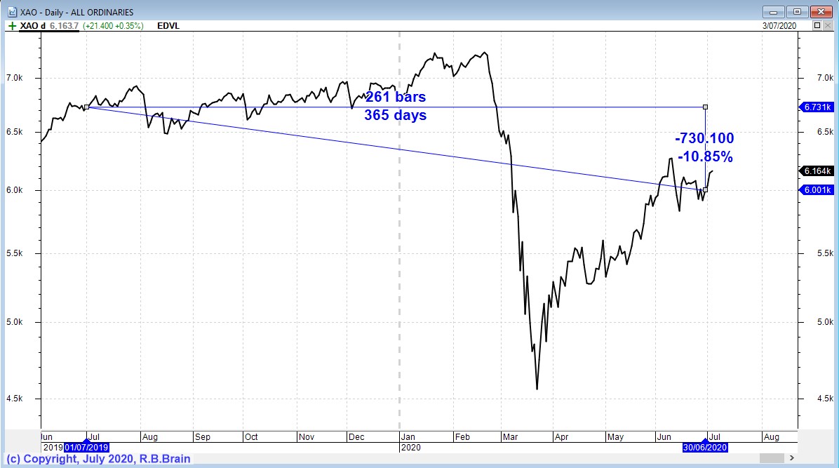
"Superannuation is down for the financial year just
ended"
This was the headline in some financial pages of the press
in the first few days of July 2020. Whenever someone writes
about the performance of superannuation funds, I find it
really difficult to comprehend. Because the many
superannuation funds and accounts are like a barrel full of
mixed fruit - they are potentially all rather different!
Anyway, if the average "balanced" super fund comprised a
large amount of share market stocks, then its performance
over the financial year might be a little like the
performance of our major market index over the same period.
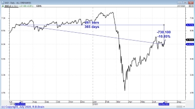
And that is what's in the price chart at right.
This chart is a daily line chart of the All Ords (XAO) index
showing the performance from 1st July 2019 to 30th June 2020
- it was down 10.9 per cent.
But take a look at the way the index crashed part way along
the time period. It is actually up significantly from the
lows of March 2020. But for some people, that does not
matter. They need to report on the performance over a
specific time period.
|
|
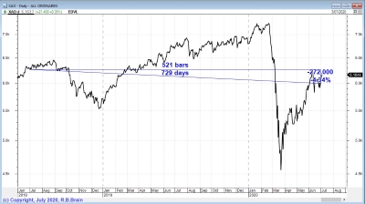
Which time period?
If we wanted to look at the performance of the market
(perhaps as an indication of how just a few super funds
might have performed), then let's look at the next chart at
right.
This is the same chart as above (a line chart of the XAO
index) but going back a further 12 months to start from 1st
July 2018.
Note that the market index was down 4.3 per cent over this 2
year period. That's still not very good is it?
|
|
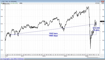
Is there a better time period?
If we wanted to find a good looking set of numbers we could
zoom this chart out and look at a 4 year period from 1st
July 2016. Over this 4 year period the index was up 12.6 per
cent. Now that's a better number to look at!
Note: Always remember that zooming the chart out to like at
a bigger time period can be very useful. Remember that the market is like an elephant! |
|
|