 |
Bear Market Twins
|
|
One of the tools in Brainy's Share Market Toolbox.
Robert
noticed that the chart of the All Ordinaries index (code:XAO)
in the bear market unfolding in
2008+ had a
striking resemblance to the chart of the same index of 20
years previous.
This observation and successive updates are included below.
Latest update:- October 2012.
Related (public) links: Australian share market BULL Markets; Australian share market BEAR Markets;
Related links (for Toolbox Members): Australian share market BULL Markets; Australian share market BEAR Markets;
About these charts
The charts below are produced using the Australian BullCharts charting software.
No Advice
The charts and comments below are purely observations of the market. They are of a general nature, and for general education only.
There is no advice.
It is recommended that you do NOT make any investment decisions based on any of the information here.
Click on any chart to see a larger view in a new window.
How is any of this useful?How can it be useful to study past information,and the charts of many years ago? |
|
| Firstly, whatever has happened in the market at any time in the past could happen again at any time. So we should not be surprised if our market was to take another tumble below the levels of early 2010. It did this in 1992 (falling 19% from recent highs) before the market recovered from the crash of 1989, and it could happen again. | Secondly, some people like to study "cycles" on charts. That is, they look for some sort of repeating patterns. Things like the number of weeks from a Peak to a Trough, or a Peak to a Peak. And the numbers 44 and 90 and 144 are amongst a few popular numbers. It is a case of view a chart (with good software), and take some measurements, and look for patterns. |
| Robert would
like to keep you informed of new
information as it becomes available, and as updates are made
here. So consider registering to receive updated
news and
information. Toolbox Members can see detailed comments about these charts, in the Members Area of Brainy's Share Market Toolbox web site. |
For Email
Marketing you can trust
|
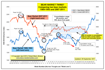
The Chart 1 at right shows that old bear market (blue) superimposed onto the more recent bear market (orange). They are superimposed with identical time scales so we can compare the shape of the two and notice that they are almost an identical replica of each other until about 2/3 across the chart. The two charts have been offset sideways so that the trough of each market coincides.
Looking at the first third of this chart, notice that the latest market (the orange curve) peaked early in the chart (Oct-Nov 2007), and fell to a low with a similar shape and in a very similar time frame to that of the blue curve (the bear market fall of 1989-90). In both cases the market then rose in a similar time frame, and traded sideways for a while. But then the similarities changed. The latest market then moved sideways for a lot longer than last time.

Chart 1 - The two bear markets superimposed.
See the latest up-to-date version of this chart in the
Toolbox Members Area.
for a larger image.
So, let's revisit the situation.
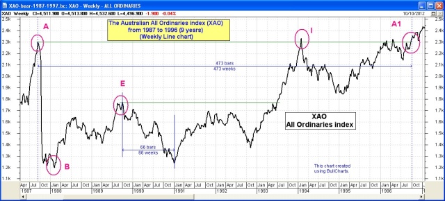
In Chart 2 (at right) of the bear market from 1987 to 1996, it shows that if we step back from the earlier Bear Market Twins hypothesis, and also consider the market crash from 1987, we might be able to make more sense of the current unfolding situation. The original Bear Market Twins idea only considered the crash from Peak E on the chart. On this chart we can see that the index fell heavily from Peak A to Trough B, then rose over a lengthy period to Peak E before falling almost all the way back to the market low at Trough B. Over the following 3 years the market had two more attempts at rising to Peak I, after which it fell away again, then finally rallied to point A1 in 1996 to make new sustained highs some 9 years after the 1987 crash. Whatever has happened before could happen again.
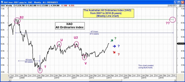
Compare Chart 2 at right to Chart 3. They both cover the same period in time (the time axis scale is the same) - they are both 9 years.
In Chart 3 at right the bear market started with a long and drawn out market crash that lasted from late 2007 (Peak S2 at the start of this chart) until the trough at T in April 2009, and we can see that the index rose strongly from the market low at Trough T up to Peak U, before faltering, then rallying again to the same level at Peak U2. This was followed by another mini-crash to Trough V. As at the time of writing, the index is still within the range of the 2007 high and the 2009 low.
Perhaps the index will eventually make new highs about 9 years after the 2007 low? (Just like 20 years ago). And perhaps it might revisit the lows of 2009 again? It is difficult to know. But one thing is sure - if it has happened before, then it could happen again.
and the latest up-to-date details,
including some percentage amounts, and
precise time counts,
see the Bear Markets analysis in the
Toolbox Members' Area.

Chart 2 - Bear market 1987-1996
Weekly chart of the All Ordinaries (XAO) index showing
the bear market that started with a market crash in 1987,
after which the index made new sustained highs 9 years later in 1996, but
only after falling on two occasions by more than 20%, and almost 20% on another occasion.

Chart 3 - Bear market 2007-???
Weekly chart of the All Ordinaries (XAO) index showing
the bear market that started in late 2007 with the unfolding of the Global Financial Crisis (GFC).
At the time of writing, the index had not made new sustained highs.
When is a bear
market
There is no clear and accepted definition for the end of a bear market.
But from an investor's point of view, the effects of a bear market are
still lingering until the market can make a new high, and sustain the
new high. An investor's portfolio of stocks will still be under water
for each stock until the price of each stock recovers. |
Conclusions
Some possible conclusions include:- The market can move a long way very quickly; but once a bear market starts, it can run for several months.
- On a Weekly chart, a bear market bottom is often a "V" shape.
- A bear market does often form a "W" pattern on the chart.
More details
Aussie BULL Markets information is freely available in the public area.Aussie BEAR Markets information is freely available in the public area.
More details about the Bear Markets and Corrections above is available from the Members Area of Brainy's Share Market Toolbox.
