
Share Market Toolbox
(public information)
|
|
Brainy's
Share Market Toolbox (public information) |
You are here: Technical Analysis > Moving Average
Related links: Trends; Stop Loss; Support and Resistance; Divergence; Breakouts; Dow Theory; Weinstein's 30-week MA |
|||||||||||
Introduction
The Moving Average (MA) will be familiar to people who dabble in statistics, where it is also known as a rolling average, or running average. In Technical Analysis, it is widely called the Moving Average, or just MA for short. Arithmetically, the MA is calculated for a set of numbers, and is basically the average of the last “few” values. Now, the last “few” values could be anything from the last one or two values, up to the last 500 or 1000 values or more. In Technical Analysis, when it is calculated for share prices, it is calculated as at a certain date. And it is calculated for every date within a date range resulting in not just one number for the MA, but a series of numbers. This will become easier to understand in the text below. What is a Moving Average (MA)?
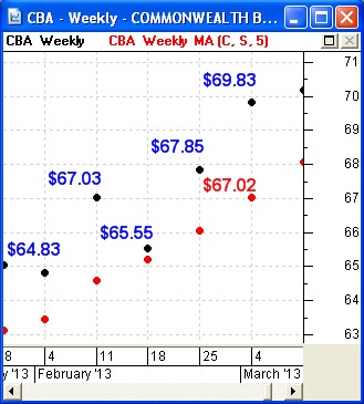
It is usually based on the Closing price; but can also be calculated for the Open, High or Low price, and is also relevant on a Volume bar chart, and many other types of charts. How to calculate the MA?To help explain how the MA is calculated, consider the simple price chart at right. The upper (black) dots are the weekly closing share prices for CBA in February 2013. The lower (red) dots are the corresponding 5-week MA as at the same end-of-week dates. That is, each MA dot is the average of the last five weekly close prices (the black dots). Notice that for the last pair of dots (the week commencing 4th March), the weekly close price was $69.83. The lower dot at that date is the corresponding MA and has the value $67.02. But how was it derived? To calculate the last MA value on that chart, we simply add up the last 5 weekly close prices which were (in reverse order): $69.83, $67.85, $65.55, $67.03 and $64.83 to get $335.09. Then we divide that result by 5 to arrive at $67.02.
The MA on a chart is usually shown as what appears to be a "curved" line, and is simply each MA dot on the chart joined together with short straight line segments. The second chart at right is the same chart as the one above, but with the dots joined together for both the share price (to produce a standard "line chart") and for the Moving Average curve. This example has looked at the 5-period MA, but any number of periods can be used. Many charting tools use the value 14 as a standard, in which case the MA is the average of the last 14 price values. Why use a Moving Average?A moving average plotted on a price chart like the samples above can help with the following:
|
More InformationeBook Articles - More details in these eBook Articles: Toolbox non-Members can see the"Page 1" of these Articles from the Articles Table of Contents page.
Terminology
Any special terms that might be used in the text at left, can probably
be found discussed in the Toolbox somewhere. Perhaps
in Brainy's eBook Articles - see the Master
Index list for details. Or, search
the eBook Articles.The Share Market - more information about the market and investing and trading. 
The toolbox is an arsenal of weapons to help you tackle the share market. See a list of contents on the Toolbox Gateway page. Robert Brain provides support to both new and experienced traders and investors. Who is Robert Brain?  And whatever you do,
beware of the sharks in the ocean! |
||||||||||
Moving Average on Volume - Volume Moving Average (VMA)
The red line on the Volume Bars is the 5-week MA. It tells us that the average weekly volumes were increasing in May and June. This is what we want to see when the share price is rising, to indicate an increasing level of interest and participation in the stock by market participants. However, in this case, the share price fell sharply from about $73 down to $65. Also notice that when the share price rose from $65 in early June up to almost $74 in late July that the red Volume MA initially rose, but then fell away, indicating a lack of interest by the market participants (an excess of sellers). Is this indicating current weakness in the price and forecasting a potential fall? - We will have to wait and see, as sometimes this does not pan out as suggested (investors and traders work on probabilities, not certainties). So, Moving Average on Volume can be very useful. Multiple Moving Average (MMA)Some people have developed variations of the Moving Average indicator for price charts, to help interpret other observations in the price charts. The Guppy Multiple Moving Average (GMMA) is one.
In this chart the candles are weekly candles (summarising the price activity for each week), but the GMMA curves are calculated basc on daily close price data. Daryl Guppy devised this particular combination of MA curves, and has explained how to interpret the strength and health of a trend from the chart. This example fairly obviously indicates a healthy rising trend. More details...For more information on Moving Averages refer to the eBook Articles in the Share Market Toolbox - see the links at top right. |
|||||||||||
|
The information presented herein
represents the
opinions of the web page content owner, and ©
Copyright 2013-2014, R.B.Brain -
Consulting (ABN: 52 791 744 975).
|
|||||||||||


 A five “bar” MA, for example, is the average of
all close
prices for the last 5 price bars (ignores non-trading days – weekends,
holidays). It can be calculated for any of: Daily chart, Weekly,
Monthly, etc. as well as for intraday periods. In fact there is no
limit.
A five “bar” MA, for example, is the average of
all close
prices for the last 5 price bars (ignores non-trading days – weekends,
holidays). It can be calculated for any of: Daily chart, Weekly,
Monthly, etc. as well as for intraday periods. In fact there is no
limit.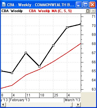 To calculate the second last MA value, we
consider the last five weekly close prices as at that date,
and
calculate the average value. And so on for all the other MA
points across the chart.
To calculate the second last MA value, we
consider the last five weekly close prices as at that date,
and
calculate the average value. And so on for all the other MA
points across the chart. 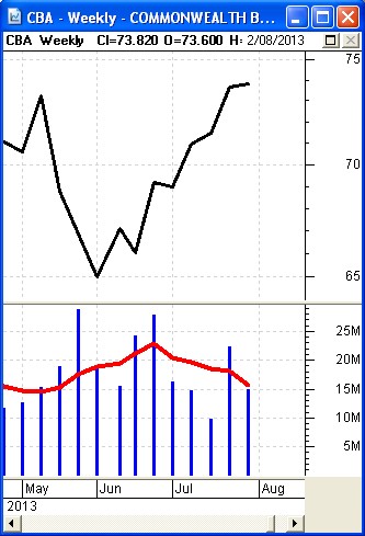 It
can be useful to apply a Moving Average to the Volume bar chart. In the
sample weekly price chart at right of CBA for the months of May to July
2013, the lower portion of the chart includes the weekly volume bars -
each bar indicates the total number of shares in CBA that were traded
in each week. Notice how they vary from a low of about 10 million per
week, up to about 29 million.
It
can be useful to apply a Moving Average to the Volume bar chart. In the
sample weekly price chart at right of CBA for the months of May to July
2013, the lower portion of the chart includes the weekly volume bars -
each bar indicates the total number of shares in CBA that were traded
in each week. Notice how they vary from a low of about 10 million per
week, up to about 29 million.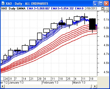 The
next price chart (at left) is a weekly price chart of the All
Ordinaries
(XAO) index from January to March 2013. It shows 12 MA curves which
collectively are known as the GMMA indicator.
The
next price chart (at left) is a weekly price chart of the All
Ordinaries
(XAO) index from January to March 2013. It shows 12 MA curves which
collectively are known as the GMMA indicator.