Share Market Toolbox
(public information)
|
|
Brainy's
Share Market Toolbox (public information) |
 |
Chart patterns
|
 |
| The opinions of market
participants are summarised in the price charts. This results in discernible "patterns" forming on the charts as well as lines of support and resistance which can be the boundaries of a chart pattern. How can we spot chart patterns? and use them? |
| You are here: Technical Analysis > Chart Patterns Related links: Trends; Stop Loss; Support and Resistance; Divergence; Breakouts; Dow Theory; Moving Average; Weinstein's 30-week MA |
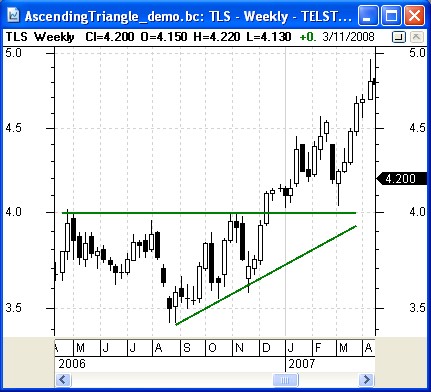
Very important! – What is a chart pattern?In technical analysis terms, a chart pattern is usually a number of straight lines placed manually onto a share price chart and which tend to contain the price action. These drawn lines can form a recognisable pattern such as a triangle, or rectangle, etc. This sounds simple, but there are also more complex scenarios as mentioned in the text below.The first thing to understand is that chart patterns form on price charts for very good reasons. And when they do form, they are telling us a lot about the collective opinions of the market participants. This is explained in more detail below, but take a look at the following chart and text for a brief explanation. In this weekly chart of Telstra (TLS) in late 2006, the share price stayed below the $4 level for at least the period from April 2006 until early December (7 months). The price rose towards this level a few times, but fell away each time. It seems as though the investors were not prepared to pay more than $4 for the shares, until early December 2006. For some reason they then changed their minds and were keen to pay more than $4. For a more detailed discussion, see the information below. Don't forget, on a weekly candlestick chart each candle summarises the price action in one calendar week. See more details about candlestick charts. IntroductionChart patterns form on price charts for very good reasons, so it can be very useful to understand something about them - why they form, how they form - as well as how to recognise the more common patterns. Their usefulness is often over-looked and under-stated. In fact, many professional traders rely very heavily on chart patterns - because the patterns tell us a lot about the underlying opinions of the market participants.r The majority of chart patterns tend to fall into these categories, with some more detail below:
And a discussion about chart patterns cannot be complete with discussing the importance of volume. This is also covered below. What is the point? Why bother with chart patterns?Traders and investors can use chart patterns to read the mood of the market, and to gauge a possible short-term change in price direction, or change in price trend, or a continuation of a trend. They can also be used to help anticipate a possible price target using the Measure Rule (or any other tool), and determine a possible Reward/Risk ratio to help manage a subsequent trade. Chart patterns can last from a few days to many months or even years (on intraday charts they can last for even shorter periods of time). As with much of technical analysis, interpreting the charts is not 100 percent guaranteed, but by understanding more about chart patterns, we can improve our chances of success in the markets. Why do patterns form? — psychology and history
The sceptic amongst us might suggest that because of the similar thinking and the influence of a majority of traders, perhaps these chart patterns are self-fulfilling. That is, there are so many traders watching the pattern form that at a crucial point in the pattern it either completes successfully, or it fails. Many traders watch the developing patterns and try to anticipate the outcome. (More details about the underlying psychology are included in the eBook Articles listed above). How to identify the chart patterns?So how do we find the chart patterns? Simply place one or more straight lines on the chart that seem to encompass most of the price action. We have done this in the weekly chart in Figure 1 above (and reproduced at right). A horizontal straight line at about $4 acts as a ceiling above the price action (called resistance) until December 2006, and an upward sloping straight line under the price action acts as support (like a floor) under the price as it rises from September through to December. It is these two straight lines that resemble a triangular shape and hence the name Triangle Chart Pattern. If you are having difficulty understanding how this can be, then consider the following. The share price for any stock can fluctuate from day to day and week to week based on the views and influences of many people. The price that someone pays to buy a stock today is demonstrating their own view about the current fair value for the stock. Over time, the perceived fair value for a stock will tend to swing between an over-priced value, and an under-priced value. We can see this in the swings on the price chart over time. And these swings can also be observed on intra-day charts, and are somewhat smoothed out as we progress to a daily chart, or a weekly chart. As the price swings between the perceived over-bought and over-sold extremes, buyers and sellers exchange the stock. A majority of people who share a similar view about the current fair value of a stock will all act together, and their buy/sell actions show up on the price chart as specific price levels. The infamous technical analysis bible “Technical Analysis of Stock Trends” (Edwards and Magee) constantly refers to this as the balance of supply and demand. As a stock's share price rises too high, sellers step in to take profits, and increase the supply of the stock. At the bottom of the price cycle, as the price falls too much, the buyers step in and increase the demand for the stock. It is easy to understand that a horizontal line on the chart could be the point at which buyers and sellers become more active. In some cases, the horizontal line is actually a wide “zone” on the chart (as could be drawn with a “fat pencil”). This can be more so on a chart of a market index which is a summary of the prices of many stocks. Continuation or reversal?Some of the chart patterns are referred to as continuation patterns, because they appear after a price trend is established, and they suggest a likely continuation of the trend. Other chart patterns are referred to as “reversal” patterns because they appear after a price trend is established and they tend to suggest a likely reversal in the recent trend. Some chart patterns can be both a continuation and a reversal pattern. Chart patterns are useful because once they have almost completed we can be on the lookout for a potentially sudden move either one way or the other. At least we can be ready for the sudden move. In the text here we keep saying "likely to". This is because the charts summarise the opinions of the market participants, and the conclusions that we can draw are based on the probable outcomes. And we have a greater degree of confidence in the conclusion that if we were to guess as the possible price movement based on fundamental, or sector strength, observations.Exactly where to draw the lines?This is a question that often causes debate. We said above that the daily close prices are most important. So it follows that the straight lines that mark a pattern boundary should be drawn based on the close prices. On a weekly or monthly chart where we cannot see the daily close prices, it is therefore appropriate to draw the lines somewhere through the tails of the candles. And sometimes it is appropriate to use a “fat pencil” to draw the lines to indicate a “zone” boundary rather than a thin line. Remembering that this is never 100% accurate nor totally predictive, there is often a little leeway in drawing the pattern boundaries. |
||||||||||||||
Brief introduction to key chart patterns(click on some charts below for a larger image) |
||||||||||||||
Basing, consolidation and rectangle patterns
Look
for the price trading in a relatively small range, and consistently
below a specific price level. Once the price breaks out, look for
confirmation (see
more details on break outs). |
||||||||||||||
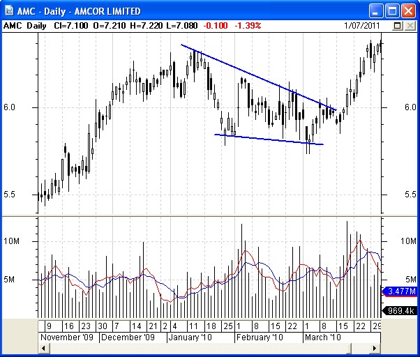
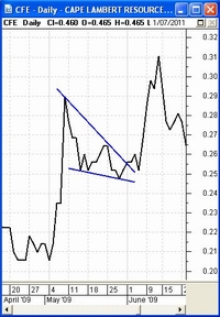
Triangle patterns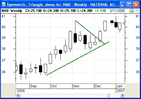 Triangle chart patterns are rather common.
 The sample at right is the Symmetrical Triangle, while the chart of Telstra above is an Ascending Triangle. The triangle chart pattern basically indicates a narrowing of the price range which market participants are prepared to pay for the stock. A falling upper boundary of the triangle indicates a declining price level that buyers are prepared to pay, while an increasing lower boundary of the triangle indicates an increasing price which buyers are prepared to pay. Triangle patterns are discussed in the eBook Article TA-3500, "Chart patterns - Triangles".  Also see a sample Descending Triangle
at right showing a strong break to the downside out the bottom of the
pattern. Sometimes the price will break to the downside, but sometimes
the price will rally out the upper side of the triangle. Also see a sample Descending Triangle
at right showing a strong break to the downside out the bottom of the
pattern. Sometimes the price will break to the downside, but sometimes
the price will rally out the upper side of the triangle.In this example, the buyers gave up on price levels above the lower triangle boundary (a support level), and with no buyers left to buy up all of the supply of the shares, the sellers reduced their prices further in order to sell the stock. |
||||||||||||||
Double Top / Bottom patternsA double top occurs in an established up trend and typically results in prices falling away (typically, but not always), hence it is often referred to as a trend reversal pattern. It is very important to observe the volume each day relative to other days. Note the following numbered points with reference to the numbers on the accompanying daily price chart of CBA. See further details in eBook Article TA-3420, "Chart patterns - more details". 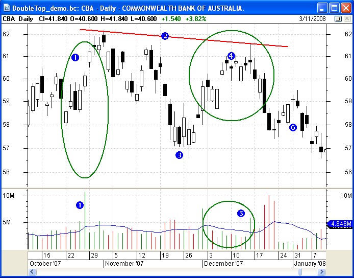
The double bottom chart pattern is simply the upside down version which typically takes place at the bottom of a down trend, and potentially signals a change in trend to the upside. Like other chart patterns, these reversal patterns are not 100% guaranteed, and can in fact occasionally result in a continuation of the prior trend. |
||||||||||||||
Head and shoulders patterns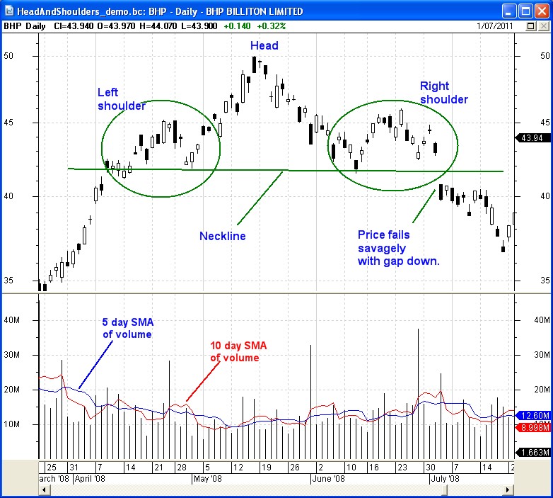
The Head and Shoulders chart pattern is a reliable and fairly well-known reversal pattern. This pattern gets its name from the resemblance to a head with a shoulder on each side (as indicated in the accompanying chart). The reason this reversal pattern is so common is due to the manner in which trends typically reverse. Both daily and weekly charts are useful in the search for these patterns, and it is common for this pattern to take 3 to 6 months to unfold on a daily chart. See further details in eBook Article TA-3420, "Chart patterns - more details".
|
||||||||||||||
Trend Channel
|
||||||||||||||
Wedge patterns
One particular wedge pattern, the expanding wedge or megaphone, is described in the eBook Article TA-3600, "Megaphone chart pattern". Also see further details in eBook Article TA-3420, "Chart patterns - more details". |
||||||||||||||
Flag and Pennant patterns
See further details in eBook Article TA-3420, "Chart patterns - more details". |
||||||||||||||
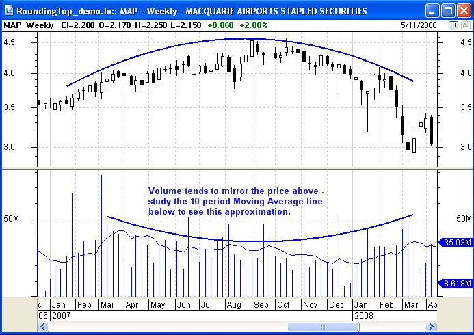
Rounding top / bottom patterns
Rounding bottoms (also called a saucer bottom) occur as expectations gradually shift from bearish to bullish. Like the rounding top it is a longer-term reversal pattern that indicates the long slow change from a downward trend to an upward trend, and can last for many months. A variation of the saucer bottom is the cup and handle pattern (not shown here), where price completes the saucer section of the pattern, then dips somewhat (to form the handle) before continuing the new upward trend. See further details in eBook Article TA-3420, "Chart patterns - more details". |
||||||||||||||
The importance of volumeIt must be stressed that the volume is a very important factor that must also be considered. A rising share price iwth falling volumes indicates a lack of support for the higher prices, and diminishing supply of the stock. A price break out above a chart pattern might be seen to be positive and suggesting that the break out might continue. However, a break out on lower volumes indicates a lack of support, and is an indication that the higher prices might not be sustained. For some examples, see the sample charts above:
|
||||||||||||||
More details...For more information on Moving Averages refer to the eBook Articles in the Share Market Toolbox - see the links at top right. |
This is one of the
many tools in Brainy's Share
Market Toolbox.
The information presented herein
represents the
opinions of the web page content owner, and
are not recommendations or
endorsements of any product, method, strategy, etc.
For financial advice, a professional and licensed financial advisor
should be engaged.